Making your business accessible goes beyond having doorframes that are wide enough and handicap parking spaces. You also need to build an accessible website, and it’s simpler than you might think. Get our top tips and learn why accessible websites benefit everyone — and could even bring more customers to your site. That’s what we call a win.
As an entrepreneur, you already know that a website is important — and hopefully, you’ve read our tips on how to design a great website for your small business. We covered everything from choosing between templated options to understanding how most people read a website to effective design without coding.
There’s another thing you should be aware of: designing your site to be accessible. While accessibility is often thought of as requirements for physical spaces, such as parking spots or ramps, it’s also a critical component of online spaces. Some of your audience may be using equipment, such as a screen reader or a keyboard instead of a mouse, to navigate your site. So, there are certain things you need to take into consideration to make that possible.
Yes! Web accessibility is important for businesses of any size. It includes core standards to ensure that anyone can successfully use your site, not just those who have perfect vision or great motor functions.
Your site needs to be as accessible as possible because you don’t want to discriminate — or lock interested customers out. If you build this priority in from the beginning, it’s much easier than trying to retrofit your entire site. Every designer or website builder should be sure it’s part of their toolkit. If you’re designing your own site, you can literally take this into your own hands. If you’re hiring someone else to help, be sure to ask how they address accessibility before making a hire.
There are tons of great tools for learning more about web accessibility and checking your site, such as the WAVE Web Accessibility Evaluation Tool and the W3 Web Accessibility Evaluation Tool.
The ranking system for compliance can feel confusing, too. Level A is the most basic compliance; Level AA is mid-range compliance; and Level AAA is the highest level of compliance, meaning the site is fully accessible.
Your website should aim to meet the AA level of web content accessibility. A good way to achieve that? Implementing these basic guidelines.
First, make sure your site is easy to use for individuals using the keyboard in place of a mouse. This means users can hit the tab key and skip past the navigation to get to the content. Otherwise, they’ll have to wait for the entire navigation menu to be read out loud to them — you can imagine how frustrating that would be, especially for sites with expansive menus.
Make sure any forms on your site are accessible via keyboard, too. If you press the tab key, you should be taken to the next form field without needing to pick up your mouse.
When you post an image on your site, it should include alternative text, also known as alt text. Alt text is helpful for individuals who have vision issues or who are using a screen reader and listening to the page.
But don’t just use the file name as your alt text. It has to be helpful. It should be a short phrase or even a full sentence that describes the image and its purpose. It should also include any text within the graphic. Context matters, too. If the image is of a specific place or person, such as Central Park or Julie Andrews, use the names instead of “city park” or “actress”.
As an added bonus, it can help with search engine optimization (SEO). When Google is crawling your website, it uses the alt text to understand, so it’s possible that someone could find it via an image search. It’s a win-win for you and your customers.
The exception to this rule is that any purely decorative images don’t need alt-text. Same goes for anything that is textually represented nearby. When in doubt, adding helpful alt text won’t hurt. But you can also use this decision tree from Harvey Mudd College.
Just like books have titles and chapter titles, so does your online content. And you have to make sure it’s written and coded in a way that makes sense to a screen reader.
That means you need to keep everything in the correct order.
Most templated websites will have options for things like Heading 1, Heading 2, Heading 3, and normal text. You’ll want to keep things in that order.
For example, Heading 1 is probably the title of your post or web page. Then, Heading 2 is a subheading. Heading 3 is a sub-subheading, and so forth. You should never skip from an H1 to an H3, or have an H2 followed by an H1, and so on. These should be kept in the same order.
If that sounds confusing, you can think of it like this:
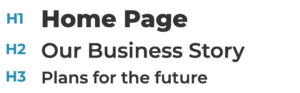
The order above is acceptable: An H2 follows an H1 and an H3 follows the H2 (multiple headlines of the same level can follow each other, like three consecutive H2s).
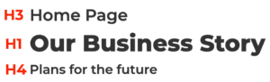
This order above is incorrect: an H1 should not follow an H3 (skipping an H2); an H4 should not come after an H1 (skipping any number of H2s and H3s).
While the styling can and will vary, generally the visual representation will always be your best indicator of hierarchy.
Did you know that roughly 8 percent of males and .5 percent of females are colorblind? Using colors that are distinct will help ensure that everyone is able to use your site as planned. AAA compliance for color contrast means that there is no difficulty in reading and differentiating between the background and the text. This is essentially black text on a white background.
When considering what to use, think of the color wheel. You might use adjacent colors like red and orange in a design, but you wouldn’t want to use them for text because there isn’t enough contrast. Similarly, white text on a yellow background is ineffective. But dark gray or black text on a yellow background would work, and so would white text on a dark blue background. (Pro tip: this goes for any buttons on your website too, such as submitting a form or entering an email address.)
Not only does color contrast make your site easier to read for those with vision problems, but it’s easier for everyone — meaning visitors are more likely to stay on your site or click on a button.
Forms are an essential part of every website, from contact pages to job applications to ecommerce checkouts. For accessibility, the most important — and most often misused — part of the form is the label.
Most labels appear directly above or to the left of fields such as a first or last name, street address, credit card number, and so on. Their purpose is to describe what needs to be entered into that field for both sighted users and, through a screen reader, those with low or no vision. They are crucial to informing a visitor about how to complete the form properly but are sometimes overlooked in favor of the less helpful placeholder text.
Placeholder text is the nice text you see within a form field that provides context, such as an example of the kind of information a field is looking for. The problem is that placeholder text is completely ignored by screen readers and not read out loud. They are strictly for visual purposes. Designers will sometimes leave labels out of a visual mockup, opting for placeholder text instead. When these designs reach the developers to build out, sometimes the crucial label is forgotten.
When designing a form, decide whether you want visible or hidden labels. If the design does not have visible labels, make sure the developer includes them in the HTML markup but hides them visually using CSS. If done correctly, the form can use placeholders for those with good eyesight and the hidden labels will be read by screen readers for those with low vision.
Creating accessible web pages can seem overwhelming, but when you start with these priorities in mind, you’ll be in the habit before you know it. Not only will you decrease the likelihood of being sued, or having complaints filed against you, but you’ll be more likely to attract more customers. A site that is easy to use for everyone also benefits everyone.
If you’re curious about other small business tools, we can help. EarthLink offers everything from high-speed small business internet to website development and more. It’s all part of creating the right connection.